Improving Candidate Search
Introduction
Recruiters on Vieclam24h were struggling with an inefficient workflow just to find a single worth-opening CV through the Candidate Search feature. It cost them 3-4 clicks minimum to evaluate a candidate, and that friction was quietly costing the company revenue.
This project was my opportunity to fix that. As the UX/UI Designer at Vieclam24h, I redesigned the CV search experience, from research and wireframes through to final handoff. The redesign directly supports the company’s goal of a 17% revenue increase in 2025.
My Role & Goals
I worked as the sole UX/UI designer on this project, collaborating with our product manager (Cuong N.), two UX researchers (Nhi N. & Anh P.) & engineering team. My responsibilities covered the full design lifecycle: translating research insights into wireframes, running rapid iterations, and producing final UI specs for handoff.
The goals were:
- Help recruiters surface relevant CVs faster, directly increasing purchase likelihood.
- Rebuild trust in the platform by addressing the reliability issues that were hurting the experience.
Success would be measured by:
- Increasing CV purchase rate.
- A 20% reduction in average viewing time per CV (for Phase 1).
- Search NPS (Phase 2).
The Problems
Before designing anything, we spent time understanding what was actually broken. Several critical issues surfaced:
 Fig 01 - Candidate database breakdown: only 40% of the 10M CVs are currently searchable.
- Limited candidate pool: Only 4M of 10M CVs are searchable.
- High click-to-view ratio: Recruiters often click through 10-15 profiles to find a relevant CV - in the best case, that’s 25-50 clicks per session.
- Filters usage in details: Location at 83%, Occupation at 52%, Gender at only 13%, Age at 5-7%.
- Poor maintainability: Each CV opens in a new tab, cluttering the recruiter’s browser.
- Poor filtering precision:
- Search surfaces results based on whatever metadata exists, regardless of quality.
- Incorrect metadata (job seekers’ CVs can be incorrectly filled).
- Slow Navigation: Page reloading for each CV view delays profile reviews.
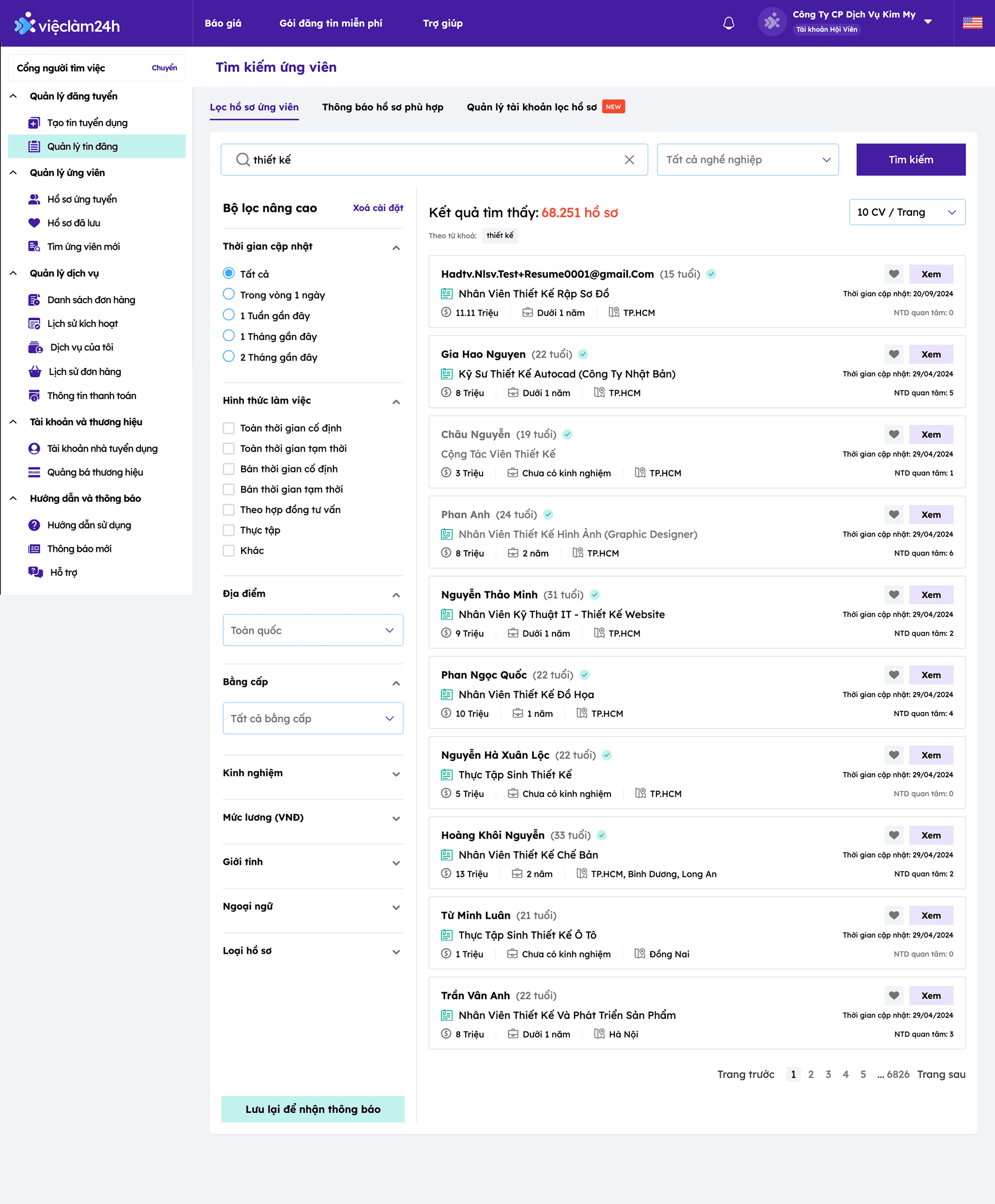 Fig 02. The old design of Candidate Search
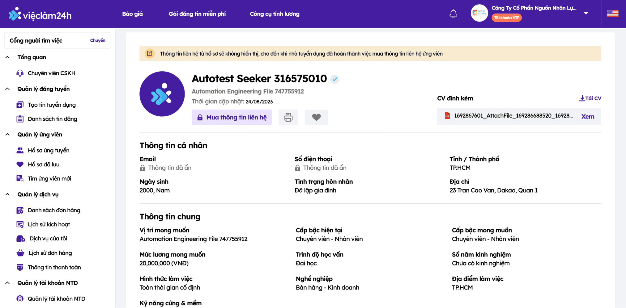 Fig 03 - The old detail view: every CV required navigating to a separate page.
Research & Competitive Analysis
We conducted a competitive comparison with platforms like LinkedIn, Vietnamworks, Careerviet, and TopCV.
| Platform | Search capability | Filter depth | CV preview |
|---|---|---|---|
| Boolean + synonym | Advanced | Inline | |
| Vietnamworks | Keyword-based | Moderate | New page |
| Careerviet | Keyword-based | Basic | New page |
| TopCV | Keyword-based | Basic | New page |
| Vieclam24h (before) | Job-title keyword only | Basic | New page |
The pattern was clear: Vieclam24h lagged behind on every axis. LinkedIn’s inline preview was the gold standard - recruiters never leave the list. That became an anchor insight for the redesign direction.
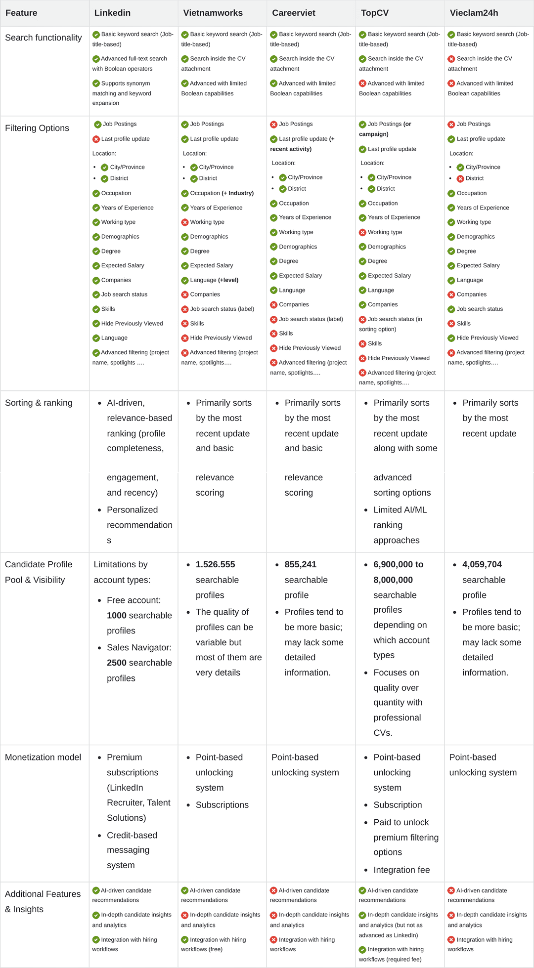 Fig 04 - Competitor research matrix: search capability, filter depth, and CV preview compared.
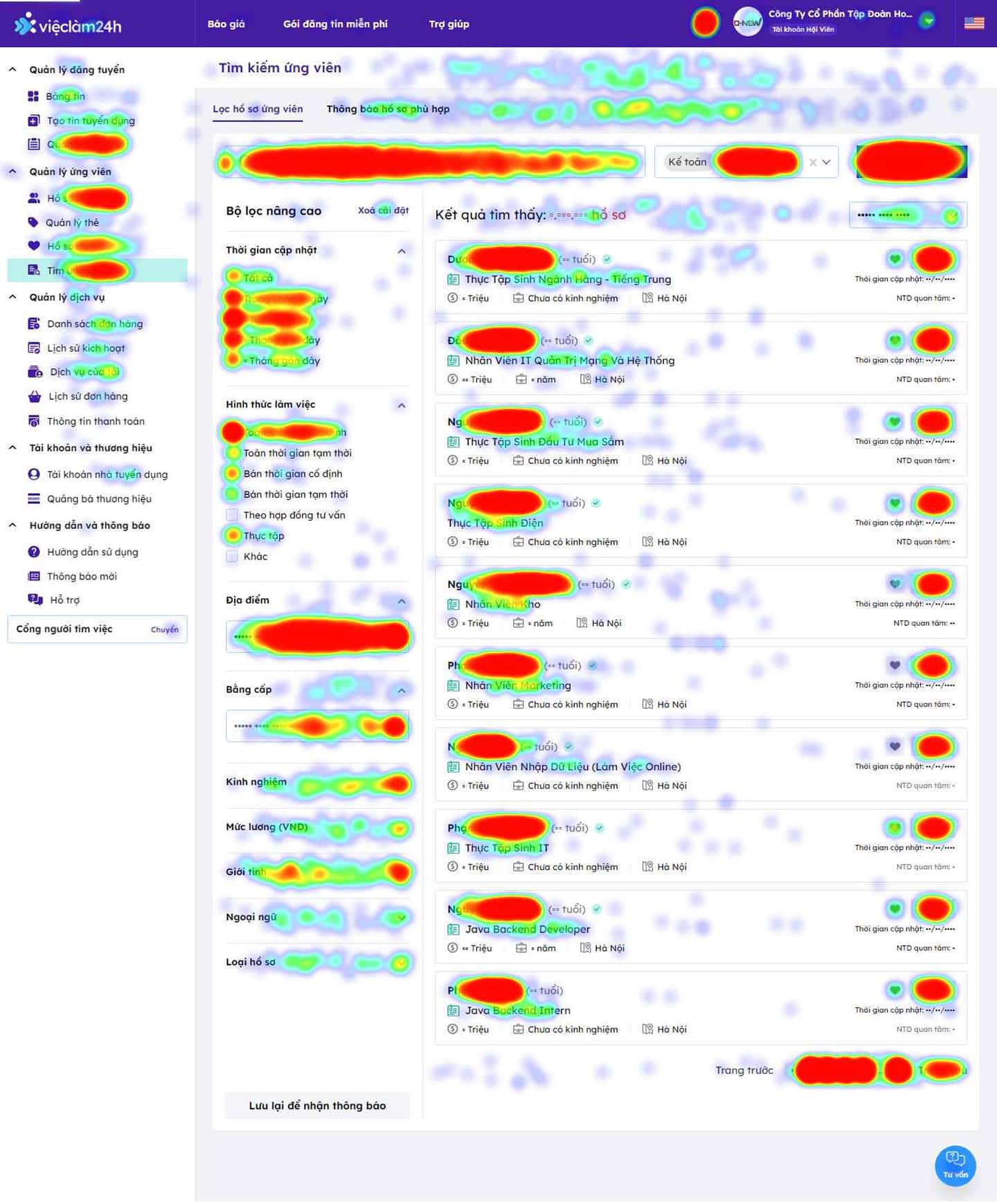 Fig 05 - The original design with heatmap data: attention clusters around job title and location; most filters go untouched.
User Insights
We conducted in-depth interviews with 10 active recruiters across industries. A few key patterns emerged:
- They prioritize CVs updated within the last 2 weeks, with the most-used filters being “job role” and “location”. “I just want freshness and location - everything else slows me down.”
- More complex filters like “industry” or “occupation” were seen as friction, not help.
- Too many clicks to browse a single CV. Several recruiters mentioned reviewing 30-50 profiles in a single session, spending less than 5-7 seconds on each. Any friction - page reloads, slow loads, irrelevant results - translated into wasted hours.
- Low conversion leads back to a 7.91% purchase rate, jeopardizing growth targets.
- Some other noticable quotes:
- HR 1: “I want to search CVs by district/county but the system does not support it”
- HR 2: “I do not know how CVs are sorted.”
Proposed Design Changes
| Insight | Design Response |
|---|---|
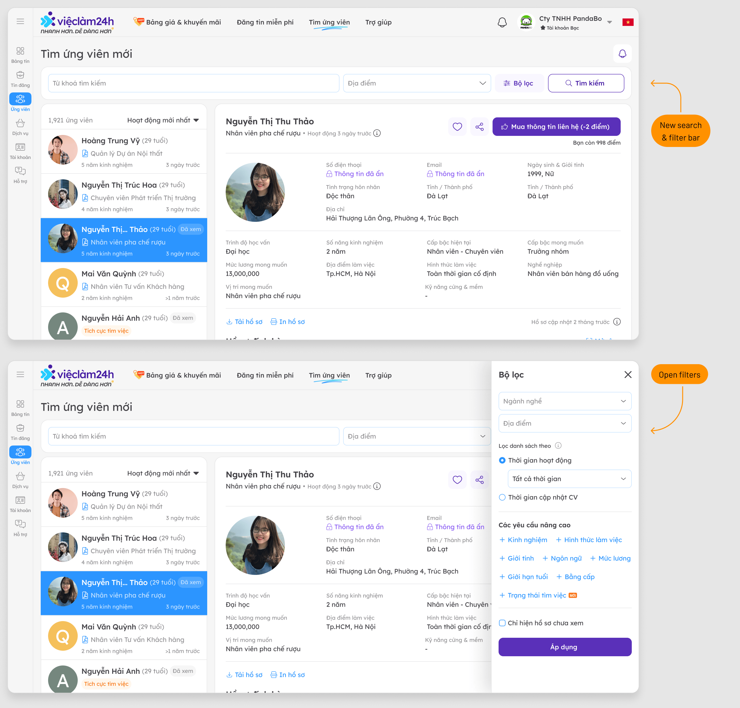
| Recruiters prioritize role + location | Unified search bar focused on those two inputs |
| ”Industry” filter causes confusion | Collapse low-priority filters (gender, age, industry) by default |
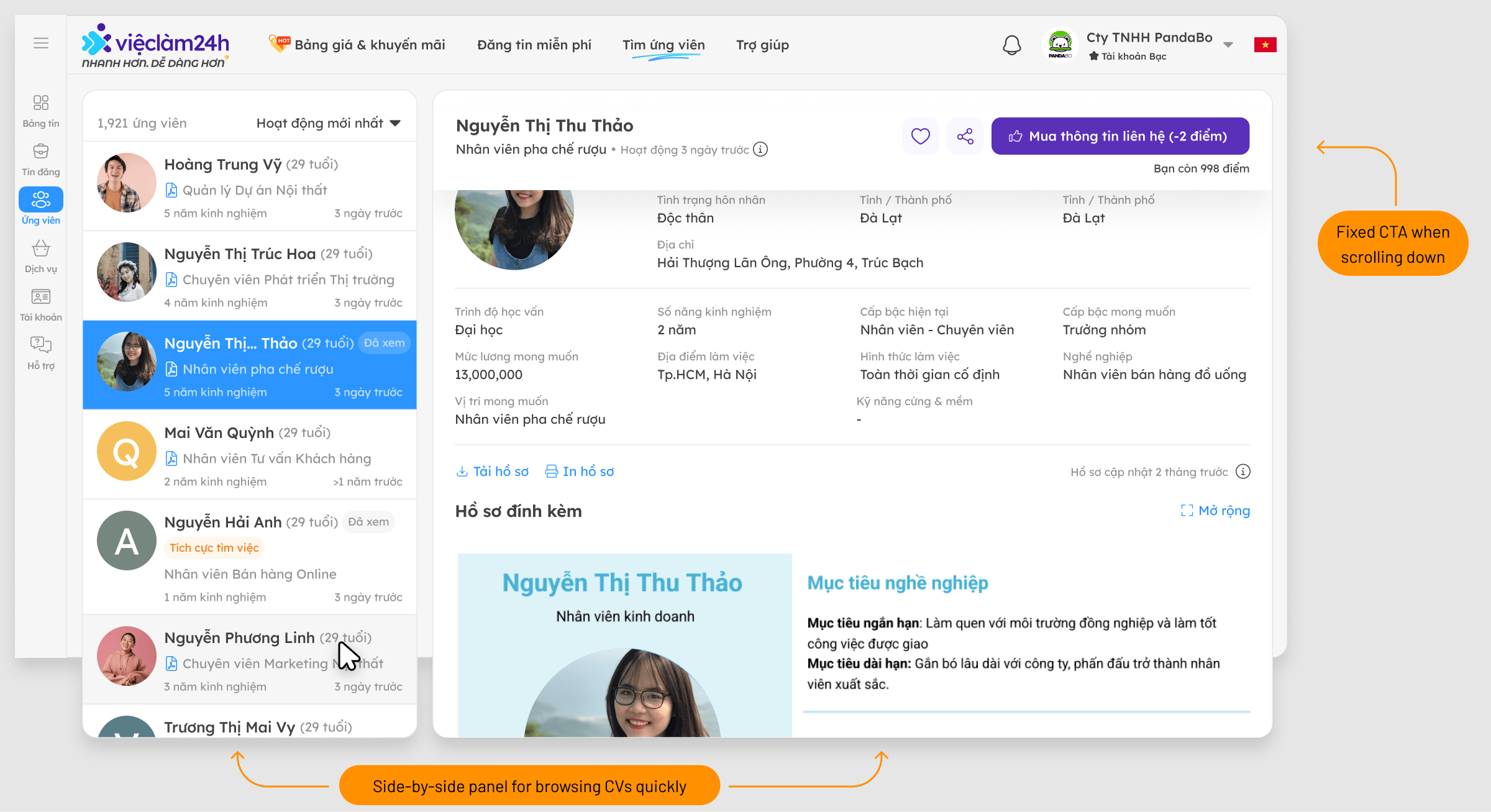
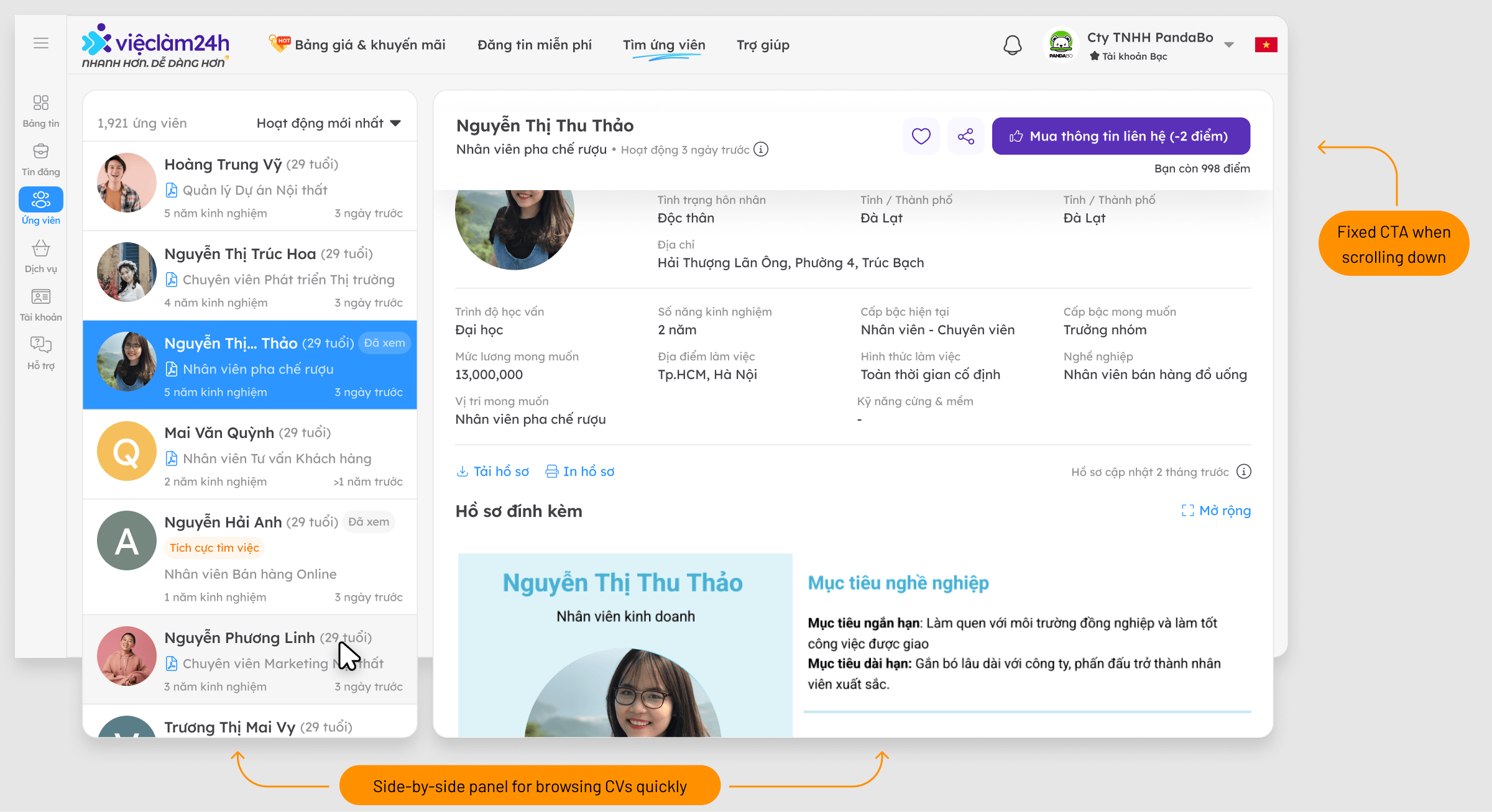
| Opening each CV is slow and costly | Side-by-side list + detail view - no page reload |
| Recruiter misses the buy button while browsing | Fixed “Buy CV” button always visible in detail pane |
Potential Obstacles
- A complete overhaul could disrupt daily users.
- The new concept must fit low-budget laptop screens (1366x768), common among recruiters.
Execution: Iterative Design
I went through several wireframe iterations and A/B concepts to refine the flow.
Fig 06 - Wireframe Iterations
7 itemsStep-by-Step Refinement:
- Optimizing Filters: Prioritized essential keywords; collapsed “industry/occupation” by default. Unused filters are now hidden but accessible with a single click.
- Narrowing the Left Menu: Redesigned for compactness, saving 200px of width for the main content.
- Implementing the New Layout: Side-by-side list and detail view for speed.
- Future Enhancements: Planning a “Suggested Candidates” tab alongside the search feature.
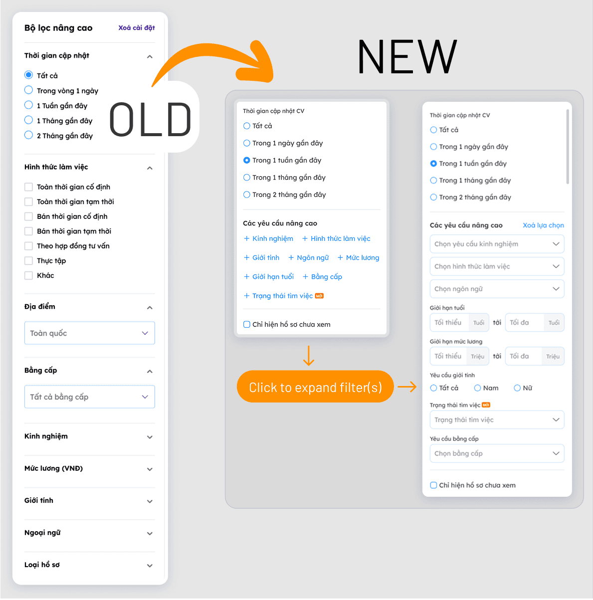 Fig 07 - Sidebar narrowed by 200px, freeing horizontal space for the split-panel CV detail view.
Fig 08 - Search Filter A/B testing
2 itemsPrototype Testing with Recruiters
Five recruiters tested an interactive prototype. Two features generated the most positive qualitative feedback:
- “Succession view” - the split-panel list-to-detail layout. Recruiters immediately grasped the speed benefit.
- “Recent activity” filter - a simple recency signal (CV updated within X days) that aligned perfectly with how they already mentally screened candidates.
Testing & Results
We performed an A/B test on the menu location (top vs. side), with the top search menu emerging as the winner. Prototype testing with 5 recruiters showed high praise for the “succession view” and “recent activity” filters.
Key Outcomes:
- Search NPS increased by 15%, with recruiters expressing high satisfaction with the new layout.
- 13% increase in CV purchase rate as recruiters found relevant profiles faster.
What I Took Away
- Proactive matching > reactive filtering. Recruiters don’t want to configure elaborate filters. They want the system to do more of the heavy lifting and surface candidates they’d actually want to call. This informed the Phase 2 direction.
- Iteration is the right strategy for entrenched tools. When users depend on a tool daily, a sudden overhaul creates anxiety, not delight. Gradual, legible changes build trust while moving the design forward.
- Constraints sharpen decisions. The filter redesign couldn’t happen in isolation - it inherited constraints from the sidebar narrowing. The 1366×768 requirement forced every layout choice to be deliberate.
Phase 2 Roadmap
The work isn’t finished. Based on unresolved pain points and feature ideas surfaced during testing, Phase 2 will explore:
- In-CV keyword search - searching within a candidate’s CV text, not just their title
- District-level location filtering - city-level is too broad for recruiters with specific office locations
- Improved result precision - likely involving metadata quality improvements on the data side
- “Suggested Candidates” tab - a proactive matching feature that surfaces candidates the recruiter didn’t know to search for